Saturday 23 February 2013

Adding the Finishing Touches

Adding the finishing touches to a painting can be daunting especially if you are quite pleased with the result so far.  You know you can take it just that little bit further but you don't want to over do it or even worse, ruin the painting altogether.  In this article I discuss how to keep your nerve and move forward slowly, seizing ground until what you have before you is something you never thought you could have achieved.

So you've been working on a painting for a while, everything is in the right place, the colours are more or less  what they are supposed to be, in fact everything is so almost perfect that you suddenly get blocked.  Where do you go from here?  Is this how it all ends?  You had imagined taking it a bit further but your energy begins to wane, you don't want to ruin it or overdo it and it's not such a bad painting as it is, in time you'll probably grow to love the little imperfections and forget that you had such great dreams for it when you started.  In the beginning you had been excited by a spark of inspiration, driven by the challenge of a new painting and the limitless possibilities of how it was going to turn out, everything flowed so easily and progress was made so quickly.  Now you can see how it will turn out, the inspiration has faded and progress is slow as you fiddle with details. The muse has left you, or worse, is whispering in your ear to go and start a new painting.

Now I'm not saying that you should necessarily go on until you are completely sick of it, who knows, you may get so sick of painting it will put you off completely and you will be so traumatized by the experience that you won't pick up your brushes again for months.  Maybe it is time to move onto something else which catches your imagination, after all the important thing is to keep painting so that you keep improving your skills.  But once in a while you will want to take the painting just that little bit further, perhaps you imagined before you started that you were going to achieve something with this painting which you haven't reached yet, that this one was going to be special, a painting which would stand out among your other paintings, your own personal masterpiece.  However, you doubt your abilities to move forward, you falter and are overwhelmed by the daunting task ahead of you, after all, you really don't know what bit to paint next.  

I'm going to take you through the finishing touches of a self portrait I have just completed.  As I have just described I was initially filled with enthusiasm, I wanted to do something spectacular, with reflections and rich colours that would be mouth watering.  A feast for the eyes.  I had the idea while making breakfast, all the colours in front of me were so vivid that I thought, this is it!  This is what I've been looking for.  As I walked though a pine forest near my home I envisioned what it would be like: to contrast with the yellows in the egg and orange juice I would paint myself wearing a bright red running top I had, like a cardinal in Rome performing a sacred rite.  The viewpoint would be from above, like an observing angel, or an adult looking down on their child as they gleefully show their parent what they have just made.  And so I would show the world, 'look what I've just made'.

It's good to start with delusions of grandeur, aim high, that's what I say.  And so I did, but inevitably I ran out of steam and the struggle to finish prompted me to write a blog entry on the subject of the final stages of a painting.  Here is my advice to those who find themselves in a similar position to me:

  • Observe and relax. If you don't know where to start just sit in front of the painting and compare it with the subject.  Don't worry about what to do next but just spend time looking at the differences.  Reset your mind and see the painting with new eyes.
  • Take it step by step, a little at a time.  If you decide that one area is darker in the subject then darken it in your painting, if it is lighter, then lighten it.  As you do this more things will become apparent and you can deal with them too, one at a time, each thing you work on bringing you closer to the final reward.
  • Work on what is easy, or interesting, first. The whole painting might be daunting to finish but surely there is one bit which is easy, or interesting, or exciting in a challenging way.  Work on this and you will find that you build momentum.  Plan to paint one part and you'll end up doing three or four, just because you have paint on your brushes and you can quickly get them in before you have a break.
  • Look at the painting as a whole.  The final stages are when you bring everything together, make everything balance and work on the relation between each colour and the next so that it has that real quality.  Sometimes one part of a painting may not look right because another part is out of balance with it.  Try to see how everything relates to each other in the subject and translate this to the painting, don't just paint things how you imagine them to be.  Even though you know the plate is white, you may need to paint it grey if it is grey in the context of light and shadow of the subject, otherwise you will never be able to make the real whites white.
So in my painting I got to a stage where everything was in place, the shapes and the shadows, and the colours were more or less right. I had had some trouble lightening the red in the top, if I added white it just looked washed out and if I added yellow it began to turn orange.  The only thing to do was to buy a tube of cadmium red light, not a colour I usually have hanging around, finally I realised why all these deep and light variants are so useful, and it really did the trick.  The top was transformed.  I also worked on the trousers more.  I had never forgiven myself for leaving the trousers unfinished in the Lucian Freud tribute I did upon his death, I suppose I could go back and finish them now but I've got lots of new paintings I want to work on so the trousers remain flat and formless.  This time I intended not to make the same mistake so I went over the trousers trying to give them shape (too much as I later decided).  This brought the painting to a nearly finished stage which started to make me want to leave it as it was.

But I could still see that the trolley on the left of the painting needed work, so I painted that and some other small details as I went.  Now I was really beginning to feel it was time to lay down the brushes but my mum commented that the hands didn't look right.  I was surprised as I thought the hands had a looseness which looked painterly, but now compared to the rest of the painting they did seem, in comparison, to lack detail.


I posted the painting on flickr under the title Enough For Now and had a break of a few days, I liked the painting as it was but knew that I could take it just that little bit further. After a breather I attacked the painting again.  To help see the changes I made I have cropped the images and put them next to each other.  The lighting was different in each photo so more of the grain of the canvas can be seen in the earlier versions, this isn't because of smoother paint in the final painting. 
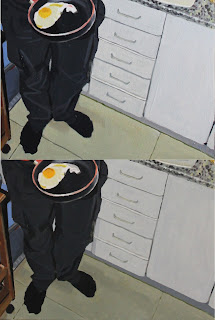
The first image shows a good example of working on a certain part of the painting by painting a different area.  I was having trouble with the brightness of my whites, they just didn't seem light enough, this I finally decided was because other parts of the painting were lighter than they should be.  The floor looked good but was slightly too light and unbalancing the rest of the painting. I darkened it and also darkened the lower drawers and cupboard while also working a bit more on the lines by defining them.  The trousers also looked too shiny, they weren't really of a shiny material so they were taking away from the highlights on the top I was wearing, which was meant to be very bright.  So I repainted them making the form less visible, and in this way emphasising the different fabrics and textures in rest of the painting.
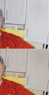
The lines on the upper cupboards were also a bit wobbly and the extractor fan was a bit misshapen, and although I resisted using masking tape to get crisp lines, which I thought would look too sharp in comparison with the rest of the painting, I did my best to get the edges looking straight.
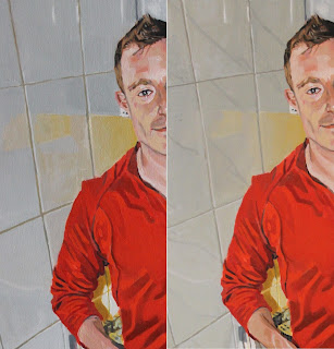

The grout between the tiles was too thick and dark and also not very straight.  Although the painting was quite big I had trouble getting such thin lines with the brush I was using as paint had got down in between the bristles and was starting to make the brush a few sizes thicker than it should have been.  I still haven't found a good solution to this yet, I've tried cleaning the brushes well and trimming the splaying bristles off with a razor but the best solution is always to buy a nice new brush with a fine point.  I find that flat brushes are best for lines because they hold more paint than a very fine round brush and go in a straight line better.  I also had a go at the marble streaks in the tiles which I was a bit uncertain of at first and had to repaint all the tiles to get them smooth enough but as I had to soften the reflections anyway, it seemed worth it.

There were some minor adjustments needed in the coffee pot, the kitchen towel hanging on the wall, the kitchen roll and the table.
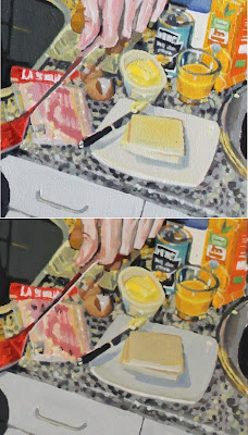


I had tried to put a highlight in the top right hand corner of the plate but pure white paint didn't seem to show up.  After a bit of staring at the source photo and back at the painting again I decided that although the plate was white, under this lighting it was grey.  Darkening the plate automatically made the highlight look more pronounced (I didn't even need to repaint it).  There were also other small changes I made to the rest of the food but I can't remember what they all were.
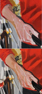
Then came the hands, I was reluctant to touch them because I had painted them in a loose flowing way and I didn't want to lose the expressive quality.  However, they did look very pink compared to the face which I had worked on more and the highlights on the veins looked too bright and a bit strange.  Nowadays I always use alzarin crimson with a lot of white in my skin tones, usually with burnt sienna and a yellow like yellow ochre or something brighter depending on what is called for by the subject's skin.   In this painting my hands were heavily reliant on alzarin crimson and little else so I added burnt sienna mixed with white and raw sienna or yellow ochre, maybe even a little cadmium yellow, and the hands looked much better.  I tried to limit the redder bits to my knuckles (which naturally are the reddest parts of my hands, I'm not sure about anyone else).


I faced similar problems with my left hand, but this really was my favourite part of the painting, so I was terrified I was going to ruin it, but I held my breath and pushed ahead.  As Del Boy used to say in the 1980s British sitcom Only Fools and Horses "He who dares wins." I believe it is also the motto of the British SAS although I imagine they rarely apply it to portrait painting.

Now this hand is once again my favourite part of the painting, and much better for those final daring dashes of paint. 


Tuesday 31 July 2012

Spontaneous Composition


From time to time friends ask me to paint a portrait for them, usually of their kids, my answer is always to send me a good photo and I'll do my best.  Maybe an artist greater than me could produce wonderful portraits from mediocre photos, but I struggle to turn out something interesting when the source is a boring photograph of person staring into the camera and grinning.  Luckily with the advent of digital cameras and cameras in mobile phones, people are snapping away constantly and I frequently get an inspiring photo to paint, and this often results in a painting even better than the source. See the Painting of a Friend´s Kid as an example of one I'm really pleased with.  When taking my own photos to paint from I always take hundreds, hoping at least one will give me that special feeling that it will make a good painting.  I suppose if I were a better photographer I could be more consistent with the quality of my portrait photos, maybe I should try to find a blog on the subject.  As it stands I rely on getting lucky with a nice photo, furthermore I have found that planning a photo shoot often results in stale, tense or contrived images.

The painting which heads this post, of Tatiana by the River Tormes, was from a spontaneous photo we took last summer with  the camera in my mobile phone.  We were walking by the river near a village called Villa Gonzalo and she started making a crown out of some flowers that were growing along the banks of the river.  Castilla y Leon is quite a dry place and there is not an abundance of flowers to choose from, lots of red poppies on wasteland in spring but this was around midsummer and the fields, sporadically populated by stumpy dark evergreen Encina trees, were already turning a sun bleached yellow. The only fresh vegetation and broad-leafed trees to be found were along the river. The shade of the tall trees provided a soothing escape from the intense Salamancan sunshine and the dappled light on Tatiana's face and shoulder inspired me to take out my phone which had a camera built in.  I couldn't hope to achieve the quality of images capable with my SLR camera, we had just been planning a picnic, not a photo shoot. However I'm glad I seized the opportunity because when I got home and had a look at the images on my computer I saw that this one perfectly captured Tatiana's delicate poise.

People often claim that painting from life is essential but there are many advantages to working from photos.  Here are some of the reasons why I use photos so much:
  • The light doesn't change.  You can paint all day and don't risk losing your initial inspiration by having to paint for an hour a day over a much longer period.
  • The sitter doesn't move or get tired.  They also don't insist on seeing the painting before it's finished, this always kills the magic for me, especially if they start looking disappointed at the half finished result.
  • The options for composition and background are greater.  You can paint an outdoors scene, or a beach scene without having to go to the beach every day.
  • You can zoom in for the detail.  I don't wear glasses and have pretty good eyesight but sometimes it is a strain painting from life if you are sitting too far from a subject to see some vital detail, the exact curve of an upper eyelid or the roundness of a nostril for example.  Maybe the detail isn't vital and the ability to see everything microscopically may provide a temptation to paint everything in such a way that you lose the objective view of the image and the painting doesn't have unity or looks overworked.
  • Spontaneous moments can be captured. 
Now we are living in a world where we are all used to seeing photos taken from every angle, in every possible location.  The traditional portrait of a figure sat looking out from a canvas looks stale and lifeless to us now, we have been spoilt by the profusion of images caught on digital cameras, smartphones or posted on social networks such as Facebook or Google+.  I think we should take advantage of these new developments, not keep claiming that there is some sort of magic when painting a person sat in front of us.  Artists in the past got very good at painting from life, if you go to any national gallery such as the British National Gallery in London or the Prado in Madrid you can see portraits of royals and important people of times gone by which would be hard to beat with regards to technique and realism.  As new paints were developed people started using paint in different ways, the impressionists for example had access to the innovation of oil paint in tubes and began to use paint in thick buttery impasto which held expressive brushstrokes.  They became more mobile and no longer tied to studios were able to paint outdoors to achieve their impressions of light and shade.  

Even this exciting exuberance soon began to lose its novelty and in the 20th century painting  went through a difficult time.  Artists didn't know where to go next so they got ugly.  There was some photorealism which I quite like but there is also a lot of abstract and aggressive art which often fails to strike a chord in me.  Jackson Pollock became fashionable when his drip paintings seemed new but he couldn't develop the idea any further and such art is easy to copy, he must have felt despair when he found no direction to go but back.  When I stand in front of abstract, expressionist or even naive paintings I often feel like the little boy in the story of The Emperor's New Clothes who could see that it was all a trick and I wonder whether the artist was fooling himself as well, putting a lot of imaginary emotion into each meaningless brushstroke.  But all this was just a failure to find anything new to do in painting, a feeling that everything had been done already.  

Although it might not seem like it, now we do have new vistas to explore in painting.  With digital photos and even more developments in modern paints there are things we can paint in ways impossible in the past, with techniques and a quality very difficult to obtain before now.  Maybe we should stop trying to be original and just concentrate on being good and then maybe we can take painting to a whole new level of beauty.


Sunday 1 July 2012

Two heads are better than one?


I just finished this double portrait for a friend of my brother, a commission of sorts.  I thought I would post a blog entry reflecting on some of the things to consider when accepting commissions for portrait paintings. 

I am quite a fast painter, some portraits I manage to turn out in a weekend or just an afternoon if there are no complications and it is just a head to paint.  My brother asked me if I would paint two children of a friend of his and I said no problem, imagining that it would be done in a week.  The photo he sent me looked quite nice, with light coming from behind the subjects, a challenge I thought!  This would be interesting.  In the background there were some beach umbrellas which looked a bit messy so I decided straight away to just paint the deck chair they were sitting on and a bright sandy yellow streaming from behind them.

I got started and painted in the main shapes, I could imagine how it was going to turn out and I was fired up with the prospect of exciting backlit faces.  Then I went on holiday for Easter along the Mediterranean Coast and my enthusiasm for this double portrait wanned, I began thinking about lots of other new paintings I could do.  By the time I got back to my easle it seemed less of an exciting project and more of a chore I just had to finish before i could paint anything else.  I began painting and did a little detail on their legs and had a rest, then some detail on their shirts and had a rest, then some detail on their hands and had another rest.  Then I left it for a week and painted nothing, over the next month or so I fiddled and procrastinated and I began to realise that although it may only take me an afternoon to paint a face with loosely suggested hair, it takes me considerably longer to paint two faces, hair, clothes, full length bodies, toes and fingers, and on top of this, complicated backlit faces!  


Part of the problem with a double portrait is that you cannot rely on each face looking real in relation to the colours of the clothes and background, it must also harmonise with the tones in the face of the second subject.  I have painted a few portraits where one child looks too pale in relation to their sibling, if they had been independent paintings then they would have been self-contained and balanced, but because their heads are right next to each other one looks like they have been out in the sun longer than the other. There is also the risk of getting lucky with one head and not with the other, when the muse descends and you catch the expression on one face perfectly with grace and ease, but then the muse goes off for a tea break and you are left struggling and over painting the second face and you begin wishing the first one didn't looks so good because the contrast really shows how badly you painted the second.  I find it's best to jump between the subjects, using the same palette but paying attention to the variation in tonal values.  In this painting it was quite difficult to capture the different shades on the kids' legs, the light was different on each one and I had to rely on just painting what I could see to try to get it looking real.


To conclude, when accepting portrait comissions you should take into account how much of the figures the client is expecting to be painted, it can be nice to include hands in a three-quarter-view portrait but even hands can really complicate things. Also, for the reasons I have mentioned, two subjects in one painting is a much more complex task than two paintings of individual subjects.  If you are not a very experienced portrait painter then maybe it's better to avoid painting group portraits and save yourself some frustration and time.  

Tuesday 12 June 2012

BP Portrait Award


So this year I entered the 2012 BP Portrait Award, I have visited the exhibition of finalists in the National Portrait Gallery a few times and have always been impressed by the talent on show.  I had been meaning to have a go myself for the last few years and finally got around to it this year.  Although I had no illusions as to winning, I thought I might get in the top 50, I mean, how many portrait painters can there really be out there?  The logistics of entering were a bit complicated, I had to leave the painting with my parents in London while I was visiting them and my dad kindly took the painting along to one of the submission days. What with the entry fee and the price for the framing of the piece coming to just under a hundred pounds it wasn’t cheap on my measly teacher’s wage, I liked the portrait and although it was simple and had no background I was feeling lucky.  It is of a student of mine here in Salamanca, Juan Blanco Blanco, a guy I respect not only for being a spine surgeon and researcher into non-embryonic stem cells, but also for being a person of strong religious faith in these secular times.

It turned out that there are far more than 50 portrait painters interested in having their work on the walls of the National Portrait Gallery, and no, I didn’t get picked.  The rejection letter goes as follows:

Dear BP Portrait Award 2012 Entrant

Thank you very much for entering this year's competition. The judges have now made their final decision and I am afraid that on this occasion your entry was not selected for exhibition. This year there were approximately 2,200 entries and only 55 were selected for exhibition, including the four shortlisted for prizes, so the competition was very strong. We wish you the very best with your continued practice and hope that you will consider applying to the competition again in the future.


So my dad had to go back into central London to pick the painting up, and I was left contemplating why mine wasn’t good enough, and whether I should give up on entering competitions completely and save my money.  Upon reflection and after having looked at the BP Portrait Award website I have come to the conclusion that I should have tried harder, maybe painted some more of the body, and included a luscious background to boot.  I won’t give up yet, but 2,200 entries is a lot to beat and I shouldn’t be so complacent next time.  At least I can reuse the frame… 

Thursday 19 April 2012

A Tribute to Lucian Freud


I painted this self-portrait last year upon hearing the news about the death of Lucian Freud.  I was a big fan of his, especially as he was a figurative painter who was working successfully through a period where abstract art was dominating the world.  I painted this without doing a comprehensive review of his work, mostly because I didn't want to end up copying his style too much. I remembered the self-portrait of himself wearing boots and standing naked with some brushes and a palette and the general feeling my memories gave me were of paintings in electric light, maybe a bit gloomy or disturbing in some way.

I decided to paint myself in a similar pose, not naked as I'm not quite ready for that, and lit with a combination of an electric light above my head and daylight coming from my kitchen behind me, and to my left the living room.  I am in fact painting this in the bathroom mirror, not big enough to get my whole body in.  I remembered Freud's paintings as seeming quite yellow and in retrospect I can see that on the contrary a lot of his portraits contain very fleshy skin tones, I however followed the impression his paintings had left on me and painted my skin tones with yellows, greens and the occasional pink and violets.  As with most painting I left it unfinished, it took over a week (nothing compared to Freud's six months or more) and I was already getting bored of it.  In the bottom left of the painting you can see how I have left a pack of mineral water bottles unfinished and my trousers are just suggested with a flat wash of black.

Thursday 12 April 2012

Wide Angles


At the beginning of last year I decided that what I really needed to improve my paintings of cities was a wide angle camera lens.  I had seen some paintings in which scenes of an urban nature were bent and distorted as if painted from photos taken through a fish-eye lense or as seen in a convex mirror.  This seemed to really suit the nature of the subject: tall buildings loomed and long roads bent around the picture fitting in lots of interesting details.  I got myself the cheapest wide angle lens I could find and went off around Salamanca taking photos of plazas and churches, monastaries and parks.  As with so many things in life it wasn't quite as easy as it seemed as the distortion I was so much craving was just too much, if I tilted the camera too high the trees and buildings fell away in a very unreal manner.  I got home and uploaded the photos onto my computer to find that many of them weren't suitable for painting, as I have often found when painting spectacular sunsets, if a photo doesn't look real then a painting of it certainly won't.  As the year passed I found that I used the wide angle lens less and less, usually opting for the one I got with the camera.  In fact the function for taking 360 degree photos on my smart phone seems to achieve results more like what I was imagining in the beginning than this expensive camera lens

Anyway, of the photos I took I did do a couple of paintings, here is one of a church, the Iglesia de San Martin behind la Plaza Major.  I had the presence of mind to take photos of the painting process and here it is, step by step.  If you want to see the photos in more detail then click on the image and it will bring them up full size.  

After I finished this painting I kept it for a while and then eventually painted over it with something else, to be honest I'm not sure which painting I convered it with, maybe one day my work will become collectable and an art museum will x-ray each painting to find half a dozen other paintings under each one.  It's not that I disliked the painting but it was rather big and I could see an even better painting waiting to take its place on the canvas.  I paint as a hobby so I see each painting more as an opportunity to learn than something that will make me money, and my walls are already too full with my favourite paintings to fit any more.  My collection is a brutal example of natural selection, if I like something I have painted then it goes on the wall, but it has to be better than what is already there to replace something.  If there is no space for it then it sits on one of my easles until it is dry and then gets put in a pile of paintings in a corner or, if it's really bad and may be embarrassing if seen by a visitor it gets put in a cupboard.  If I don't have any blank canvases to paint on when I get the idea for a new painting then I just grab my least favourite in the pile and paint over that.  And so happened with this painting, now it only exists in digital form.  And so natural selection picks off the weak paintings and leaves my collection stronger.


I began with a yellowish undercoat, as usual I was using some old paint left over from another painting so the yellow went on in an uneven manner as I mixed it with more white and then more yellow.  As the strange wide angle was important I took time to get the lines of the building and the pavings an the floor at correct angles.


I approach the addition of detail differently in each painting, in this case I added all the shadows and dark lines first over the underpainting to preserve the pencil drawing underneath the undercoat.


Here I am adjusting the colour of the sky so that it doesn't look so muddy and I can get the rest of the colours correct in relation to it.
Next the lightest points on the painting went in.  I think I made the church too white and this was a reason for me eventually painting over this.  In fact most of the stone in the historical centre of Salamanca is a beautiful yellow somewhere between naples yellow and yellow ocre.
I keep adding blocks of colour, here the bottom of the church is being painted in.
As the painting begins to take shape I have to adjust some of the yellow underpainting as it was beginning to look harsh in relation to the rest of the tones.
I keep working to get everything balanced.
Here I've painted the pavings a more accurate tone. Click on the image to get a better idea of what is changing.
In this photo I am getting rid of more of the underpainting, filling in between the gaps.
Here is a close up of me adding some detail, I like to use a brush bigger than I think I can handle and then the final result looks less over-worked.

The finished painting, as seen on the easle.
As usual I try to take a photo where there is no light reflected on the painting, then I crop the photo on a photo editor and sometimes adjust the levels if the light I have taken the photo in is too yellow.  I always try to get it looking the same as in real life, sometimes it can be nice to up the contrast a bit, but it's easy to go to far and lose some of the subtlety of the actual artwork.


Friday 23 March 2012

Backgrounds and Clothing


When painting a portrait I am always confronted with the question of how much background to put it, whether to keep the focus on the face and just suggest the subject's clothing and hair or to pull out all the stops and put detail in across the painting.  The background question is often dictated by the quality of the background in any source photo I might be using, sometimes it seems unsuitable for a portrait, or looks like it may distract from the main focus of the painting, and I end up just filling the background with one colour.  This choice of colour varies from painting to painting, I might try meditating on a colour wheel for a while to pick a contrasting colour, or alternatively choose something that is already in the painting in order to highlight it.  Sometimes I just pick a pleasant light tone such as a light green or blue, if it doesn't work then you can always paint over it, occasionally I end up trying various colours before settling on one.

In the case of the painting at the top of this post, All Hair and Elbows, the background in the photo was quite dark and a bit gloomy, a yellow-brown.  The grey I've used looks somewhat similar but a bit lighter and with the colour neutralized it makes the figure stand out more.  I also chose to show some brush strokes, I usually prefer to do this rather than paint everything in a flat plane of colour (as I did in the painting of my brother which can be found in the Family Portraits post) but this is a personal preference.

Flat planes can be very pleasing especially when painting with acrylics (as they tend to flatten upon drying anyway). If you do the whole painting like this then it has a cut-out paper effect or something which looks like it has been done on Photoshop using a filter.  I do quite like this style but if everyone is just using Photoshop and printing onto canvas with a giclĂ©e printer then I'd prefer to do something which doesn't look like it can be achieved so easily.  One of the beauties of paint is the texture and the possibilities of expression it has in every brushstroke.  Although I am not a particularly expressive artist, mainly because I can't really evaluate or appreciate my own paintings when they are too abstract, the human imprint on a painting is something which my soul delights in. I would like all my brushstrokes to be unlaboured and harmonious like movements in a dance and yet in conjunction to provide a window to a moment that is authentic and real.  I am always improving and working towards this ideal but usually fall short on both of these points to varying degrees, I suppose that is what keeps me painting: the desire to do it better next time.

Some painters choose to do a graduation of colour from dark to light in the background, maybe I'll try this one of these days but until now I seem to have unintentionally avoided this, either prefering to put in one tone or suggest the background as I did in Worried Maybe in the Creating a Scene post.  I seldom paint everything in great detail behind the subject although I think this might be a good idea as I've seen a lot of portraits by professional artists where they do this, although in these cases the background is usually relevant or reveals something about the subject's character or profession.

The same question applies when approaching the detail in the clothing of the subject, whether to go to great lengths to describe every fold and crease of their attire or just suggest it with a few loose brushstrokes.  In my experience I've found that although it can be nice to focus attention on the face and maybe hands with more detail than the clothing, a big difference can make it look unbalanced or like I got bored or ran out of energy (as is often the case).  Some artists of the past and present graduate the detail so that it becomes more hazy as it moves towards the edges of the painting, I've tried this but usually end up finishing it off otherwise it looks too much like a sketch.

In the painting which heads the post I meticulously painted all the little rings in the dress, each one has a slightly different tone and shape and the result is a 3D effect on the arms and chest.  I could have worked on it a bit more but I found myself going a little crazy staring at each circle and pondering how different it looked from its neighbours.  It took about three passes over the painting to reach this point, the first to get the shape and colour and and then two more to get everything the correct tone relative to everything else so that it didn't look flat.  It's always possible to keep working on a painting, getting it closer and closer to what is in the source photo, but you always have to stop somewhere, sometimes you feel that it looks finished or that any more work you put in will get you no better a result or sometimes you just feel bored and burnt out.

The best feeling is when you are pleasantly surprised at what you've achieved: the painting is better than you pictured in your head when you started out, you've taken the image in the photo to a whole new level by rendering it in paint, and you are afraid to touch it because you have no idea how you got it to this point, as if something magical had just happened when you were lost in concentration and the folds of a dress.
Related Posts Plugin for WordPress, Blogger...